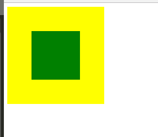
示例图
1.position加margin 父元素和子元素高宽都固定,使用绝对定位的方法居中1 2 3 4 5 6 7 8 9 10 11 12 13 14 15 16 17 18 19 20 21 22 23 <div class="parent"> <div class="child"> </div> </div> .parent { width: 200 px; height: 200 px; background: yellow; position: relative;} .child { width: 100 px; height: 100 px; background: green; margin: auto; position: absolute; left: 0 ; right: 0 ; top: 0 ; bottom: 0 ;}
2.display:tabel-cell 父元素必须为tabel-cell,子元素必须为display:inline-block
1
2
3
4
5
6
7
8
9
10
11
12
13
14
15
16
17
18
19
20
21
<!-- html --> <div class="parent" > <div class="child" ></div> </div> .parent { width : 200px ; height : 200px ; background : yellow; display : table-cell; vertical-align : middle; text-align : center; } .child{ display : inline-block; vertical-align : middle; width : 100px ; height : 100px ; background : green; }
不需要考虑父元素的高宽,可以做自适应,但是子元素的高宽必须限定
1
2
3
4
5
6
7
8
9
10
11
12
13
14
15
16
17
18
19
20
21
22
<!-- html --> <div class="parent" > <div class="child" ></div> </div> .parentss { position : relative; background : yellow; width : 200px ; height : 200px ; } .child { position : absolute; background : green; top :50% ; left :50% ; -webkit-transform :translate(-50% ,-50% ); transform :translate(-50% ,-50% ); width : 100px ; height : 100px ; }
4.flex;alige-item:center;justify-content: center 子元素和父元素都无需限定高宽,移动端兼容性良好
1
2
3
4
5
6
7
8
9
10
11
12
13
14
15
16
17
18
19
20
<!-- html --> <div class="parent" > <div class="child" ></div> </div> .parent { background : yellow; width : 200px ; height : 200px ; display : flex; align-items : center; justify-content : center; } .child { background : green; width : 100px ; height : 100px ; }
5.display:flex;margin:auto 兼容性没测试过,移动端适用
1 2 3 4 5 6 7 8 9 10 11 12 13 14 15 16 17 18 19 <div class ="parent" > <div class ="child" > </div > </div > /* css */ .parent { background: yellow; width: 200px; height: 200px; display: flex; } .child { background: green; width: 100px; height: 100px; margin: auto; }
6.tranfer -50% 百分比来设置宽高
1 2 3 4 5 6 7 8 9 10 11 12 .vertical-center { position absolute top 50% transform translate(0,-50%) } .vertical-horizontal { position absolute left 50% top 50% transform translate(-50%,-50%) }
1
2
3
4
5
6
7
8
9
10
11
12
13
14
15
16
17
18
19
20
21
22
<!-- html --> <div class="parent" > <div class="child" ></div> </div> .parent { } .child { position : absolute; top : 50% ; left : 50% ; width :50% ; height :30% ; padding :20px ; text-align :center; background :#393 ; color :#fff ; transform : translate(-50% , -50% ); }
7.高宽不定 1 2 3 4 5 6 7 8 9 10 11 12 13 14 15 16 17 18 19 20 21 22 23 24 25 26 27 28 29 30 31 32 <!-- html --> <div class="table" > <div class="tableCell" > <div class="content" >不固定宽高,自适应</div> </div> </div> .table { height : 200px ; width : 200px ; display : table; position : relative; float :left; background : yellow; } .tableCell { display : table-cell; vertical-align : middle; text-align : center; *position : absolute; padding : 10px ; *top : 50% ; *left : 50% ; } .content { *position :relative; *top : -50% ; *left : -50% ; background : green; }